In a nutshell
- 🎯 The shopping brain responds to colour salience: red and high-contrast cues spike dopamine and reward prediction, shortening deliberation and nudging approach behaviour.
- 🛍️ In-store design uses a strategic palette—Red = urgency, Yellow = attention, Blue = trust, Green = savings—plus contrast, anchoring, and eye-level placement to speed decisions.
- 💻 Online, colour must survive dark mode and distraction: rigorous A/B testing, strong accessibility contrast, and pacing—hot hues for scarcity near checkout, cool tones for assurance like delivery and returns.
- ⚖️ UK rules matter: the ASA/CAP Code and CMA scrutinise “was/now” pricing; ethical colour use means clear claims, consistent cues, and reduced buyer remorse and returns.
- 📈 The winning strategy balances urgency with trust: right hue, right moment, right claim—driving conversion today while compounding loyalty and lifetime value tomorrow.
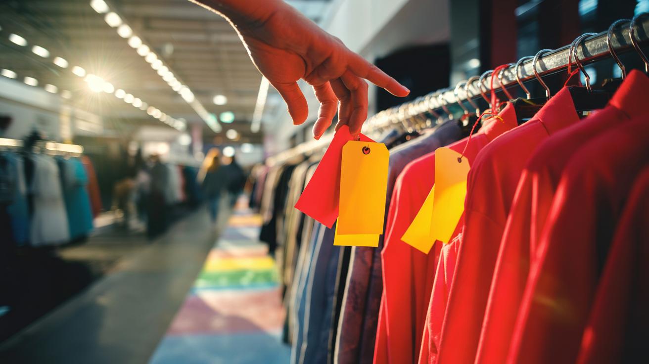
Red shelf barkers. Yellow stickers. A blazing “70% OFF” block that seems to thrum in your peripheral vision. These aren’t just bright accents; they’re levers on the brain’s reward systems, engineered to make saving feel like winning. Retailers talk about “driving conversion”. Shoppers describe a “little buzz”. Both are pointing to the same neurochemical nudge: dopamine. When colour-coded sales simplify choice and signal urgency, they tap prediction and reward circuits that shortcut deliberation. Colour is a shortcut to attention, and attention is the toll gate to impulse. On the British high street and inside apps, the palette is policy. The question is how — and why — it works so quickly.
The Neuroscience of Colour and the Shopping Brain
The human brain loves patterns. It also loves shortcuts when those patterns promise a deal. A red tag screams salience, prompting vigilance and arousal that prime the approach motivation often mislabelled as “impulse”. In this state, dopamine doesn’t simply deliver pleasure; it encodes reward prediction, nudging you to pursue the option most likely to pay off. Dopamine predicts purchase before reason catches up. That’s why the first glance can be decisive. The eye locks to contrast. The mind fills in narrative: rare, limited, must act. Short routes fire faster than slow ones.
Colour also shapes perceived value. Blue steadies; it signals trust and competence, useful for guarantees and returns. Yellow is the highlighter of retail, excellent for “Last Chance” cues. Green whispers “saving” and “eco”, encouraging virtue alongside value. The real trick, however, is rhythm: moments of intense signal against a calm field. This oscillation keeps the salience network alert without fatigue. If everything shouts, nothing sells. Silence is the amplifier that makes colour cues sing. The best merchandisers stage peaks and plateaus, persuading without exhausting.
Designing the Sale: Palettes, Price Tags, and Priming
On the shop floor, colour is choreography. Retailers use contrast to isolate deals from full-price rails, and they stack anchoring—the “was” price—in tones that soften pain while the “now” price lands in a high-contrast hue. Typeface, edge thickness, and white space matter too. Small decisions compound into speed: the faster a brain can parse offer type, the less friction sits between curiosity and checkout. Colour-coding is a language; fluency converts browsers into buyers. In British outlets, red remains the urgency cue, but black-and-white signage now frames “extra 20% at till” events to signal credibility and avoid noise overload.
| Colour | Signal | Likely Effect |
|---|---|---|
| Red | Urgency, clearance | Faster decisions, higher basket add |
| Yellow | Attention, last chance | Increased footfall to fixture |
| Blue | Trust, assurance | Confidence in returns, warranties |
| Green | Savings, sustainability | Reduced guilt, add-on purchases |
| Black | Premium, event sale | Perceived exclusivity, higher ASP |
Placement is politics. Eye-level bands carry prime signals; endcaps run the splashy reds; mid-floor islands get yellow “extra off” flags that feel like discovery. Subtlety can outperform spectacle when price rises bite and shoppers seek reassurance. The winning palette today blends a trustworthy base with sparing shock. Make the deal obvious, not obnoxious.
Digital Versus In-Store: How Colour Cues Shift Online
On screens, hue speaks through pixels and pace. A crimson “Add to Basket” button can leap against a muted interface, while a pastel badge may drown in the scroll. Online, colour must survive compression, dark mode, and ambient light. That’s why e-commerce teams obsess over A/B testing button shades, border radii, and hover states. Small tweaks yield big deltas when multiplied by millions of sessions. In digital retail, the right colour can buy you milliseconds — and milliseconds buy you sales. Yet accessibility reshapes the palette: sufficient contrast, clear states, and non-colour cues for colour-blind users broaden reach and trust.
There’s also the matter of context. In-store, sensory overlap helps colour: music tempo, fabric feel, human energy. Online, colour competes with alerts, feeds, and fatigue. Smart sites time their bursts. They deploy scarcity messages in warm hues during checkout, not on landing, to avoid bounce. They reserve blues and greens for assurance: delivery dates, free returns, and secure badges. When algorithms personalise banners, the palette can adapt to time of day, device mode, and historical responsiveness. The principle remains classic. Make urgency hot, make safety cool, and pace the two like a heartbeat.
Ethics and Regulation: When Nudges Become Manipulation
Not every dopamine nudge is benign. Shoppers deserve clarity, not theatre. UK rules matter here: the ASA/CAP Code challenges misleading price comparisons, and the CMA has warned against “was/now” claims that lack a genuine reference period. Colour can’t be a cloak for fiction. The brighter the signage, the cleaner the claim must be. Ethical design uses palette to make information legible, not to bury conditions in tiny greys. When retailers align colour cues with truth—clear stock levels, honest timelines—the dopamine buzz meets satisfaction, not remorse.
There’s a commercial case for restraint. Returns erode margin; buyer’s remorse corrodes brand equity. Swap the pressure red for a steady blue on subscription offers, and cancellations fall. Keep clearance hot, but cool the commitments. Build a consistent colour language across touchpoints so shoppers learn what each hue means and trust it. The outcome is durable: less friction, fewer complaints, stronger lifetime value. In short, design for loyalty, not jolts. Good colour ethics compound like interest.
The dopamine rush behind colour-coded sales is real, but its power rests on precision: right hue, right moment, right claim. The palette is a promise, and shoppers test promises quickly, with their thumbs, wallets, and word of mouth. When retailers balance urgency with assurance, they turn split-second attention into satisfaction rather than regret. That’s the craft — and the competitive edge — in a cautious UK market. As you weigh your next campaign or browse your next aisle, what colours will win your trust, and which will make you walk on by?
Did you like it?4.7/5 (22)